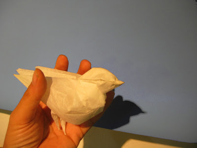
I’m not going to show you two week’s worth of experiments on the Fat Pigeon. My table is littered with bird carcasses, and my brains are in worse state because once I start I don’t stop and now two weeks are gone from my life. The problem, besides the wounded pride hinted at in the last entry, is that I foolishly listened to R. J. Lang two years ago in Barcelona, when he said ‘birds really ought to have their feet point-split’. I disagreed, but out of politeness conceded that “this was at least true for pigeons.” And here was my old Fat Pigeon, standing around pigeon-legged instead of pigeon-toed.

Unfortunately the most obvious way of solving this puts a nasty pleat at the edge of the paper; legs and claws can then be made as long as you like. Now, while I dislike box-pleating I am not opposed to it in principle, if the pleats are put to some artistic effect when the time comes. But here the pleated bulk ends up in the worst place, locked uselessly within wings and tail; and to tie up 20 or 30% of the square just so you can later pry apart some toenails—no, that I will not do. So far as I’m concerned you may as well start with a rectangle or cut the paper.

I have since come up with some more reasonable solutions, supposing feet must indeed be split. But let us first look a little more closely at this assumption, and what is behind it.
Birds have feet, no? So splitting toes is a way of making improved, more representationally-accurate origami—isn’t it?
Not necessarily. Google any picture of a robin or any other small bird. Half the time, do you even see the feet? Feet seem to be something of an embarrassment for bird aesthetics. That is: even male birds, which use flashy colors for their bodies and even sharper detailing on their heads—along with eye-catching profiles that may be egg-like or sinuous—even such birds, who are hardly ashamed of calling attention to themselves, use the universal language of crypsis when it comes to their feet. Feet and even legs on small birds are often thin, reedlike and brown, blending right in to the ground or twig they are perched upon. Sometimes they are knobby and ugly, in contrast to the gorgeousness up above, and in that way too slide attention off themselves.
In other words, a representation of feet may be accurate anatomically without being accurate visually. Drawing attention to them, to show that you are a moderately competent designer who knows how to split a point, is doing something that may be in conflict with what the bird is trying to do, and also with how a bird’s image lingers in the mind.
What, then, is driving the point-splitting of bird-feet in origami, if it isn't aesthetics? It seems to me there are two factors. First is that the older style, from early Yoshizawa, where feet were made by a simple (or a double) reverse fold, really is unsatisfactory in many cases. The bird ends up looking like it is wearing boots. Point-splitting here is a legitimate response to a problem, and is indeed an improvement if (a) you want a stable standing animal and (b) the bird’s feet are going to be looked at anyway. Of course you can also bite the bullet and leave the legs as one long point, or eliminate them altogether as LaFosse had the courage to do.
But a second factor is the current fashion of super-complex, hyper-technical origami, which regards it as an embarrassment if any long points are left anywhere unsplit. A pleasant illustration of this is provided in the Swan by Noboro Myagima, that appears in the AEP Convention Book 2005 (another ‘Barcelona bird’…). The folding sequence is 149 steps long. But at the end of these 149 steps, you do not end up with a Swan which is noticeably better than the ones you learned as a child, that took 10 or 15 steps. Myagima’s model does, however, have one advantage over those older, more modest ones: its feet are point-split. We may note that it holds this advantage over real-life swans too, which, alas, are stuck with merely webbed feet .
Getting back to the carnage from the last two weeks:
I took the Fat Pigeon [CP], a form almost 20 years old--a completely natural, lyrical, geometric sequence from a Stretched Blintzed Bird-Base--and made endless modifications to it, sacrificing purity of sequence for end-results (for we are no longer virgins). To list only the changes I am keeping: Off-centering the Bird-base, allows the tail to be made longer than the wings without additional folds. Off-centering the Blintz buys you all sorts of things. If you want to, you can have a model that’s fully rounded (I mean 360 x 360 degrees). I chose instead to use the extra material from the overlapping ‘blintz’ for various color-changes and also to design what is, at last, a reasonable lock, so the front stays in one piece (without wet-folding etc). Wing ornaments and so forth can be added optionally.

* * *
Simple as all this still is----it may not be simple enough. A standing bird has fundamentally four points, even when its wings are slightly split. A four-point model ought to designable reasonably from a bird-base. And if it’s a bird base, then the principle of continuous complexity ought to apply, and feet can be point-split if one cares to, a beak opened, and so forth, all from essentially the same beginnings, and stopping whenever one has had enough.
Can this be done?
Stay tuned.
